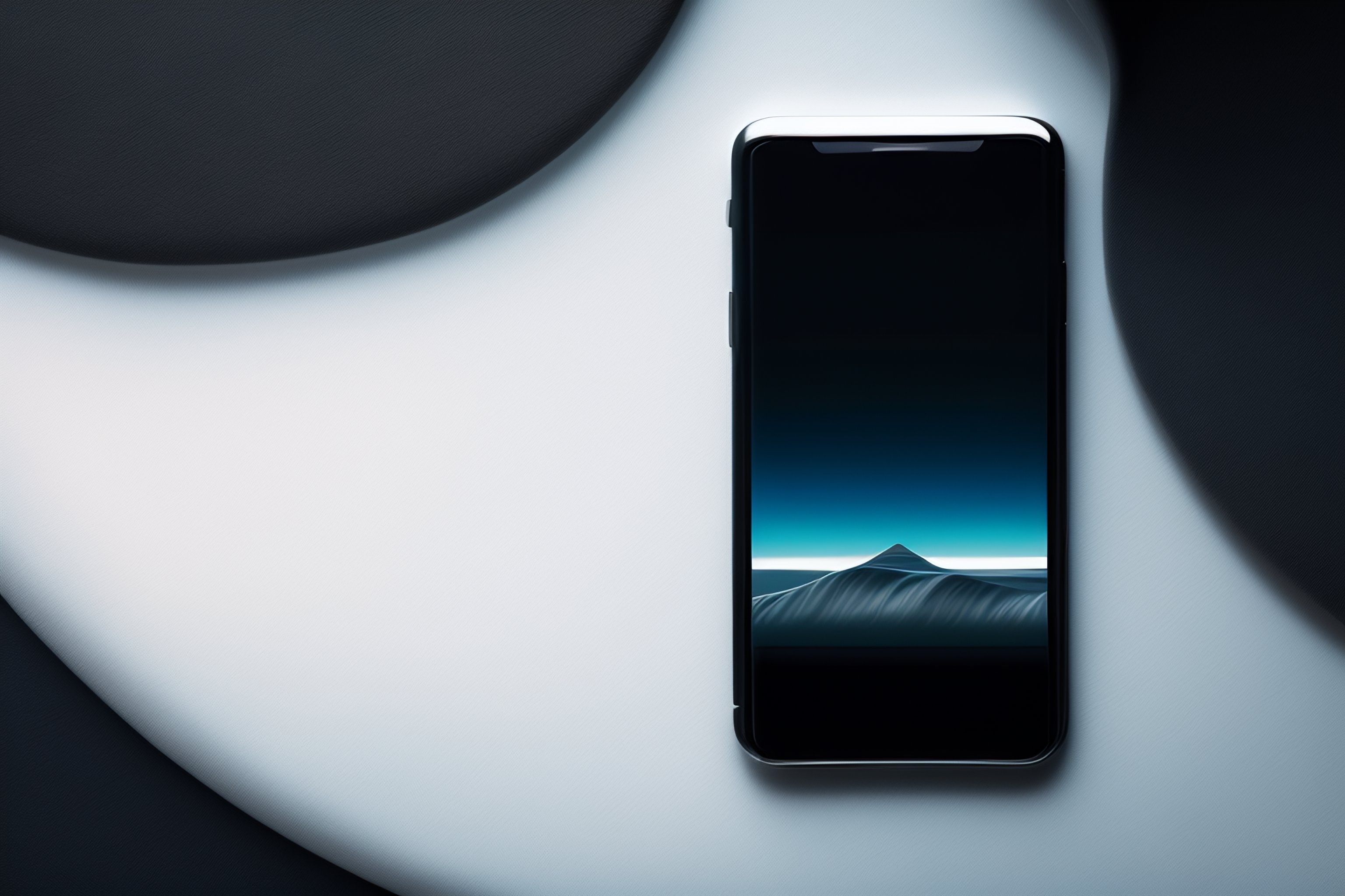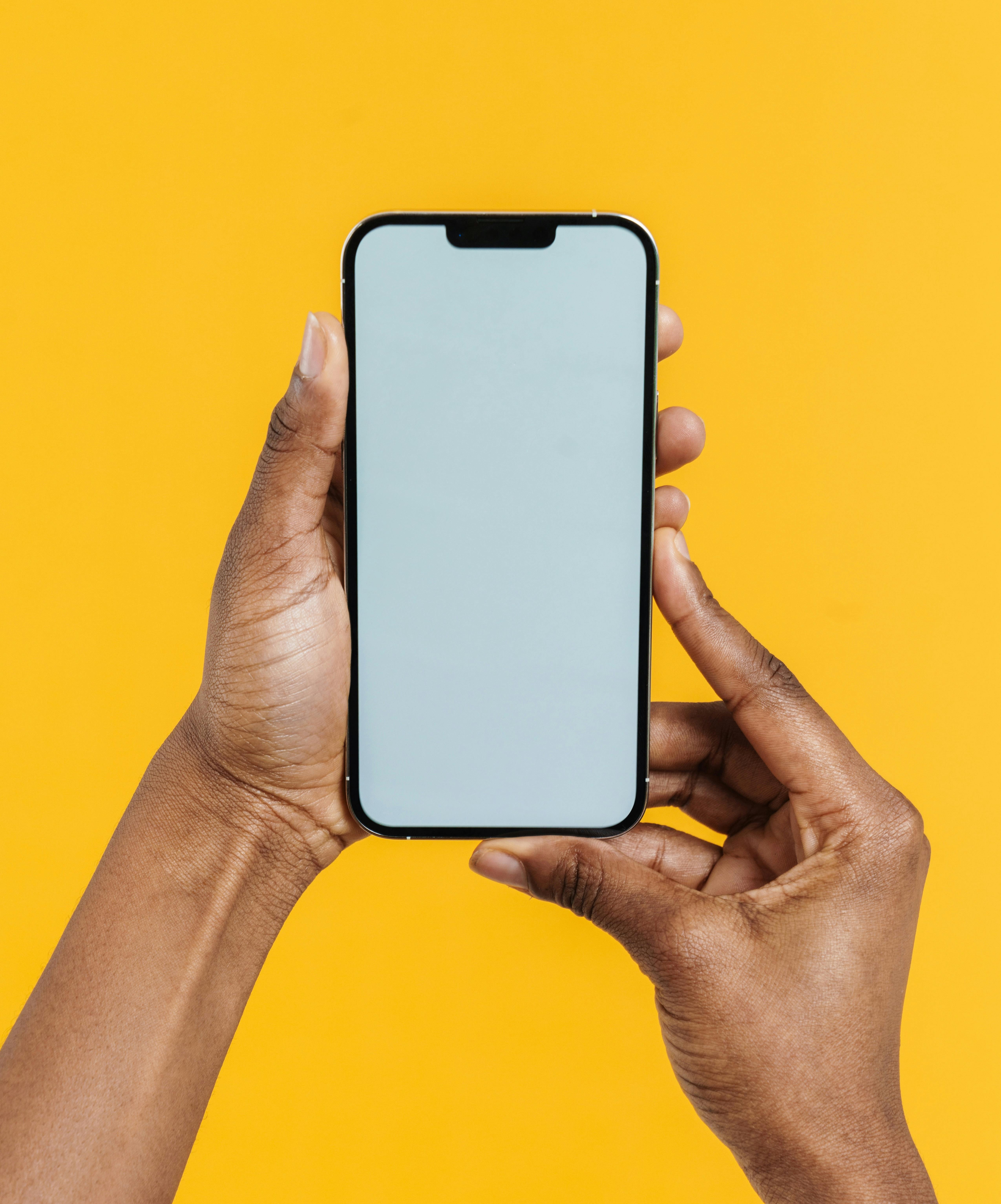
Apple products, including the iPhone, appeal to us with their attention to good design. The influence of designs isn’t just rational, it communicates to us on an emotional and subconscious level. For this reason, we can’t always describe it well in words. It creates a feeling and we might not understand the ways that the product is visually appealing to our subconscious. Whilst each new iPhone launch involves discussion of the latest features – camera quality, screen resolution, battery life – the design of the device itself has been just as precisely engineered to create this emotional appeal.

Design is a way to differentiate products that may have similar functional capabilities. Since its launch 17 years ago, the iPhone has inspired many imitators, and other smartphone brands are competing within the same range of technical capabilities. Yet why do certain brands of phone inspire such strong feelings in their fans?

As of 2024 Apple have sold 1.5 billion iPhones. There has been much discussion lately about over-dependence on digital devices and the addiction to dopamine hits we get from their ever-present stimulation. But could the iPhone's success in particular be explained by the way it follows a set of specific principles of how things visually appeal to our brains?

Neuroscience studies on how people automatically react to different designs lead me to believe that Apple are – either deliberately or accidentally – using principles that visual neuroscience tells us work well in design.
1. First Impressions
Apple make efforts to ensure that the design of each new version of the iPhone doesn’t leak before their official launch. This allows them to carefully control the exact way that the public first see their product.
Neuroscientists have discovered that we can form an impression within seconds (sometimes in less than a second) of first seeing a product or image, and this impression will then stick(1) . Our later feelings and attitudes towards the product will have been shaped by this first reaction. Therefore, getting this right, and presenting a product in its best light, will help frame our long-term feelings towards it.
In addition to its technical capabilities, the presentations in which Apple first reveals each new iPhone typically also focus our attention on its appearance and design features. Neuroscience would suggest that this has a big impact on guiding how we all feel about the iPhone.
2. Pleasing proportions
Since classical times, designers and architects have been tapping into our brain’s in-built love for certain proportions. One of these is a shape known as the golden rectangle. This is a rectangle with particular proportions: the long sides are 1.6X the length of the short sides.
Whether it’s in ancient Greek temples, or Renaissance paintings, we see rectangles of these proportions in many beautiful designs.
It just so happens that the iPhone’s screen – like the form-factor of many enduringly successful products – is approximately in the form of a golden rectangle. The proportions aren’t exact, but visual neuroscientists have found that there is a range of rectangle height-to-width ratios that we find pleasing (2).
Of course, this shape also is a good shape for fitting into the palm of our hands, so its visual appeal may be accidental, yet it is nevertheless there!
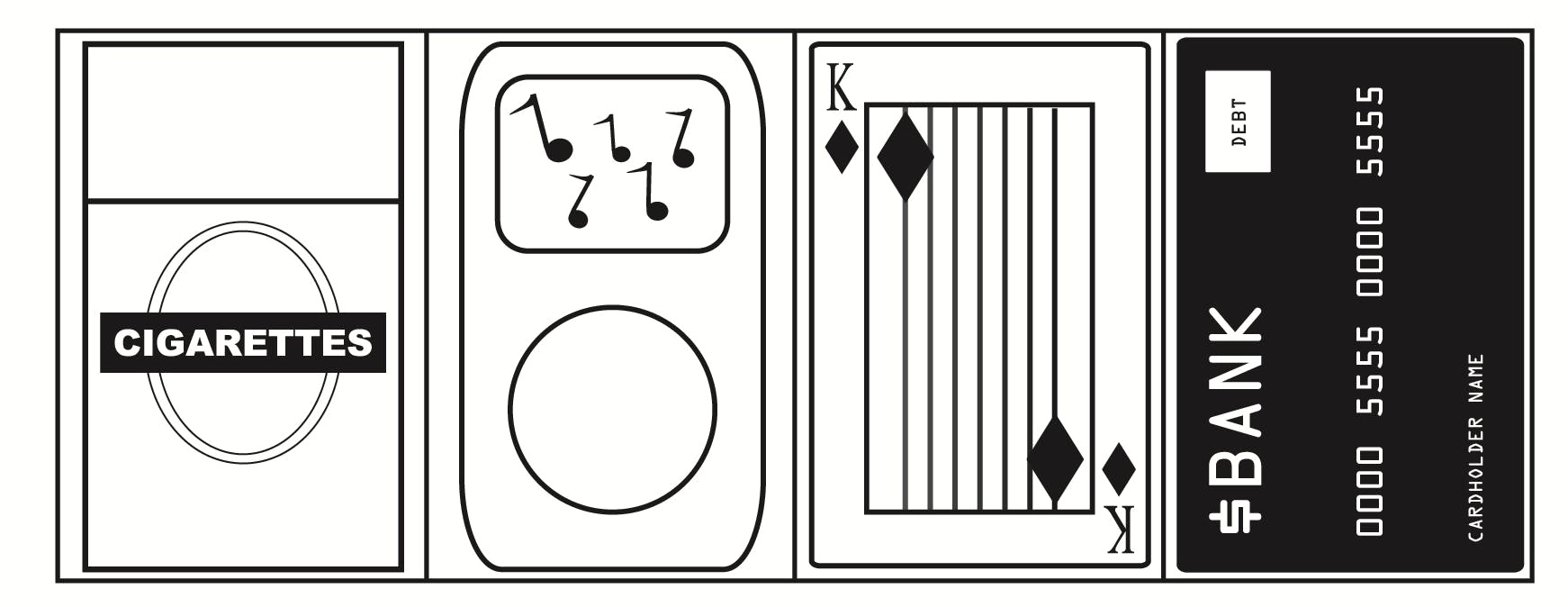
(below are some examples of classic product forms that are also in this ratio.)
3. Unexpectedly familiar
Psychologists have long known that the more familiar something looks, the more we tend to like it. They call it the ‘mere exposure effect’ (3).
However, more recent studies have shown that things are a bit more complicated.
We all know that things that are too familiar can appear boring, and that we all can be attracted to looking at something just because it's new. What subsequent studies show is that images that are familiar, yet still have a touch of the unexpected, are particularly appealing to us (4). A good example of how this works in real life is if you bump into someone familiar to you – such as a friend or neighbour – in somewhere you don’t usually expect to see them – such as in the airport, for example – it can put a smile on your face in a way that it wouldn’t if you just saw them in the usual environment.
4. Intuitive Physics
A relatively new area of psychology – called embodied cognition – studies how we use our bodies and our knowledge of the physical sensations of the world to influence our thinking and emotions. For example, this can be seen in how we talk about things: if something is important we might describe it as ‘weighty’ or ‘heavy’, or if something is hard to do we might describe it as ‘rough’ (and, conversely, easy things as ‘smooth’).
From the time we’re babies we are used to understanding things through their physical features like weight, smoothness or temperature. It comes easy to us, and because we don’t have to think about it too hard it feels intuitive and therefore pleasing.
The iPhone, since its original launch, has incorporated a number of these types of physical-world metaphors to help make the product look and feel intuitive. For example, the iPhone introduced the user-interface techniques known as rubber-banding (the way the screen will snap-back, like a rubber band when scrolled as far as it will go and let go) and inertial scrolling (the way a screen will continue to scroll after your finger has left the screen, as though it had its own inertia, like something physical) to smartphones.
The device itself feels comfortable to hold and has a pleasingly 'heavy' feel for its size. Its an under-researched area, but I suspect that there are particular weight/size ratios that feel intuitively satisfying to us. The device also incorporates pleasantly curved corners. There is a body of research showing that curves are inherently appealing. One of the reasons for this is that we probably evolved to be naturally sensitive to spotting and avoiding sharp edges in order to avoid being cut. The particular type of curves that Apple uses are, perhaps unsurprisingly, not random. They are known as Bezier curves, and are believed to be particularly attractive to the Human eye.
Maybe our age was always going to be the age of the smartphone. But it was Apple more than any other brand that managed to make the most psychologically appealing smartphone. Perhaps Android users will disagree! Nevertheless, the care that Apple put into the design of their products clearly shines through with the iPhone. And maybe its biggest flaw is that its so captivating that we use it too much!
References
(1) For example, see this study on reactions to webpage designs: Lindgaard, G., Fernandes, G., Dudek, C. and Brown, J., 2006. Attention web designers: You have 50 milliseconds to make a good first impression!. Behaviour & information technology, 25(2), pp.115-126.
(2) For a review of the evidence see: McManus, I.C., Cook, R. and Hunt, A., 2010. Beyond the golden section and normative aesthetics: why do individuals differ so much in their aesthetic preferences for rectangles?. Psychology of Aesthetics, Creativity, and the Arts, 4(2), p.113.
(3) Zajonc, R.B., 1968. Attitudinal effects of mere exposure. Journal of personality and social psychology, 9(2p2), p.1.
(4) Bornstein, R.F., 1989. Exposure and affect: overview and meta-analysis of research, 1968–1987.


