Implicit Results
This is an automatically generated report based on the results of everyone who had taken this test. Our tests generate raw data that can be exported as a .csv and analyzed in many ways, we can also generate reports which display charts such as these automatically created based on the data.
These are some basic examples but we are working towards creating more advanced, automatic reports that can show more levels of detail. These could include separating and comparing results based on a survey question such as age or gender.
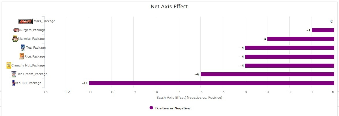
The Net Axis Effect is the most simple graph , with bars extending to the left or right to represent the strength of results for each axis. An axis consists of antonym and attribute poles, which are combined to show the Net Axis Effect for each prime compared to the baseline results.
Negative values, which in the bar graph are lines going to the left, represent a combination of negative attribute results or positive antonym results and positive bars, going to the right in the default display, represent positive attribute results and negative antonym results.
With attribute poles, positive values represent a faster response time compared to the baseline and a closer association between the attribute value to be sorted, while antonym poles are adjusted to be the reverse, and negative values represent a faster response time.
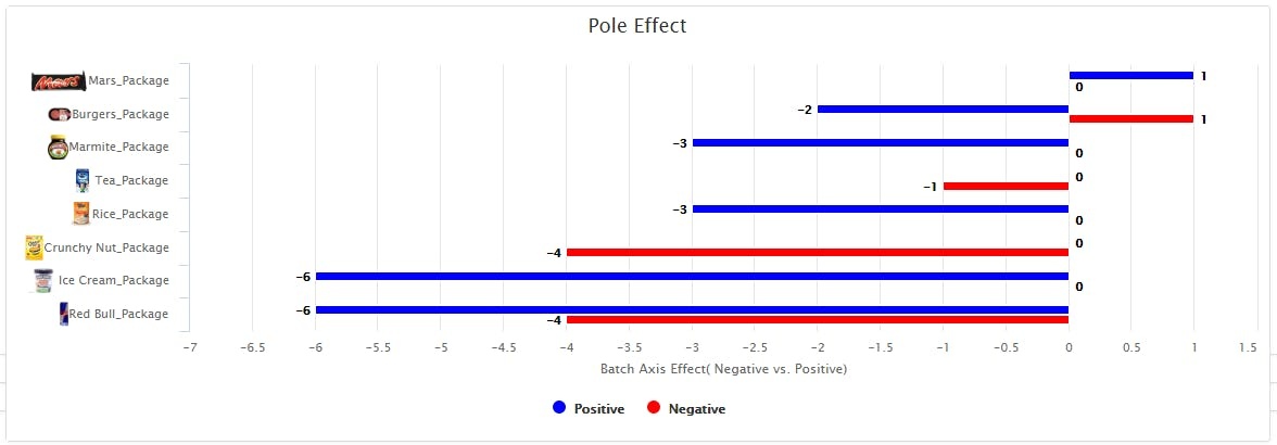
The Pole Effect is a more detailed graph that explains where the effect is coming from. This shows each of the axis poles results separately, rather than combining the attribute and antonym.
Just as in the Net Axis Effect graph, with attribute poles positive values represent a faster response time compared to the baseline and a closer association between the pole value and the target word to be sorted, while antonym poles are adjusted to be the reverse, and negative values represent a faster response time.
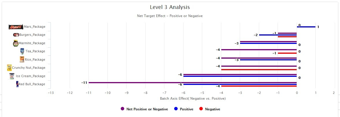
The Data Analysis chart shows both the Net Axis Effect and Target Effect sizes, so it shows separate effect sizes for each of the targets used in the axes. This way one can visualize how the Pole Effect sizes and Net Axis compare on one graph. These Target Effect sizes will be the same as the Pole Effects unless a pole has multiple targets, which this test did not.


