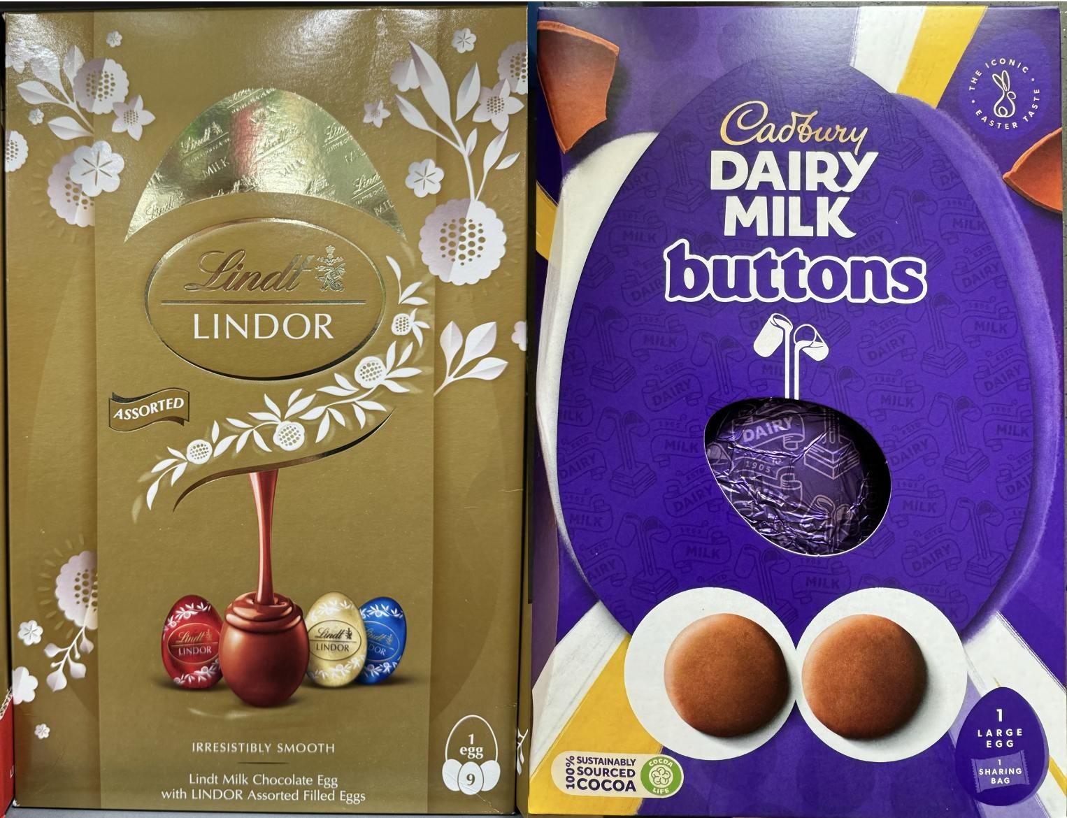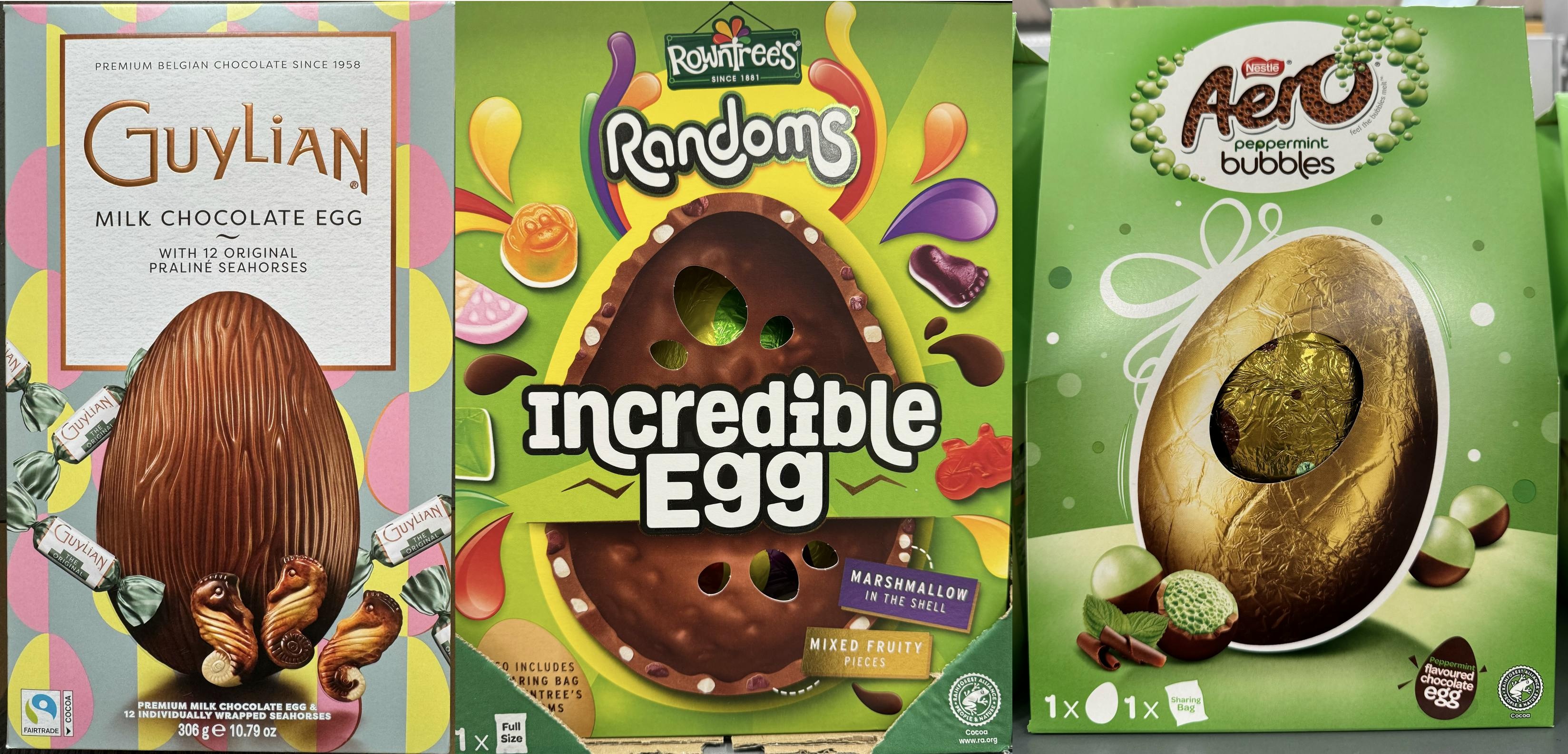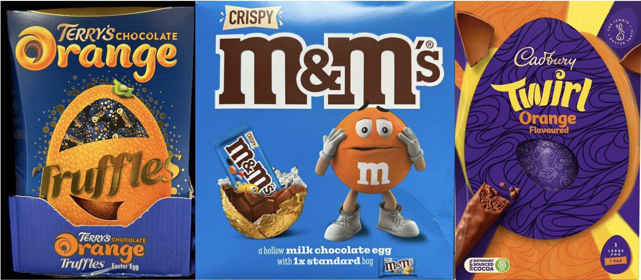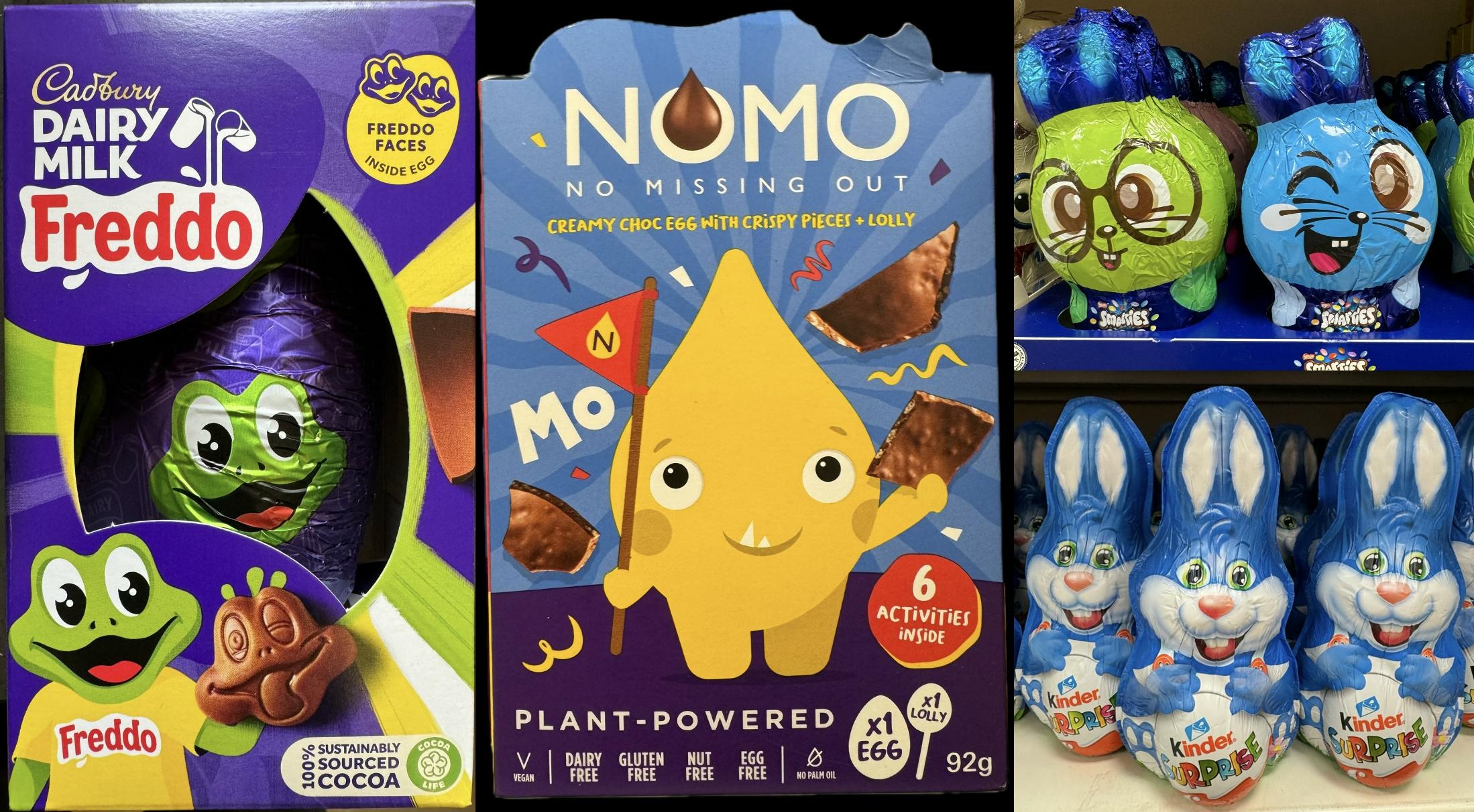
Chocolate Easter eggs bring joy to two key demographics: children (of all ages) and package designers! For a number of reasons, these products take more risks with their packaging than with most grocery products. These reasons include: that they are a confectionary product, often they are a gift, they appeal to children, and they are a temporary/seasonal product. The packaging is more elaborate, with more varied shapes and more bold graphical design. Yet they still need to be crafted to appeal to shoppers' psychology.
I’ve been taking a look at some of this year's chocolate egg packaging in the U.K. through some of the same lenses of psychology and ‘neuro design’ principles that we use at CloudArmy when asked to research packaging.
Chocolate Imagery
Firstly, the most obvious aspect of the packaging design: how delicious does it make the chocolate look? When we study package designs for food products, we test the ability of the food imagery to evoke emotional and appetite appeal using response time measures like our Fast Choice and Implicit tests.
Surprisingly, many of the packs don’t take as much advantage of the potential for really delicious and attention-grabbing photography of chocolate as they could. Nevertheless, some do and here are some of the design strategies they employ.
One particularly effective food photography technique for grabbing attention is the depiction of movement.
Cadburys have a simple icon of milk flowing from two glasses. Bringing both the attention-grabbing benefit of implied movement but also acting as a distinctive visual asset that they have invested in over a long time.
Another design trick to making food look appealing is to show its texture. The Guylian egg has a very distinctive outer texture that they have decided to feature prominently on their packaging. Both the Randoms Incredible Egg and the Aero peppermint bubbles egg feature the inside of their egg-shaped candies in their designs.
Use of color
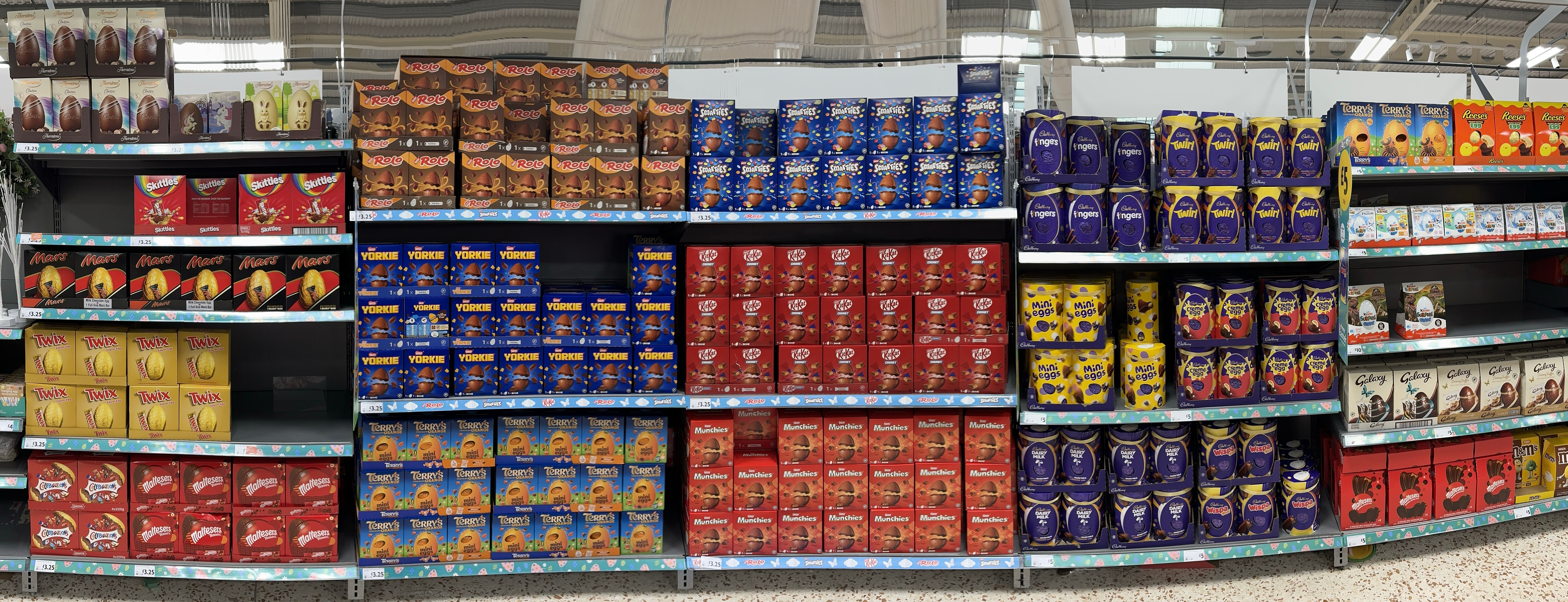
While there is a wide variety of colors used in this category, one color that seems to be used frequently is red. Even though chocolate itself isn’t red, this color does have a natural automatic association with sweetness. This probably originated with the association of sweet ripe fruits with the color red.
Another interesting pattern that is used frequently in this category is the combination of red or orange and blue. This might seem like a weird pairing, particularly as blue itself isn’t necessarily associated with chocolate or sweetness. The reason for this pairing is probably the chromostereopic effect. This refers to the fact that certain color combinations can be hard to look at, as it’s difficult for us to focus on both simultaneously, yet they can create a pseudo-3D effect with the color on top appearing to float above the color behind. This effect, while not experienced by everyone, might help to make these designs more attention-grabbing. It works with red on blue, but also yellow on blue and green on red.
On shelf stand out
A drawback to the great variety of colors in this category is the difficulty to make your package stand out. Our CloudArmy consultants frequently use a range of tools to measure the attentional ‘pulling power’ of pack designs, including eye-tracking, Findability tests and algorithmic measures of attention on retail package images and displays.
One perennially effective design technique for both grabbing attention and emotionally engaging people is the use of faces. I found several good examples of this. We are hard-wired both to rapidly notice faces and for our attention to be captured by them. Further, we have a predisposition towards childlike cute faces, which helps to explain the popularity of the cartoonish characters that children naturally like and that are featured frequently on these pack designs.
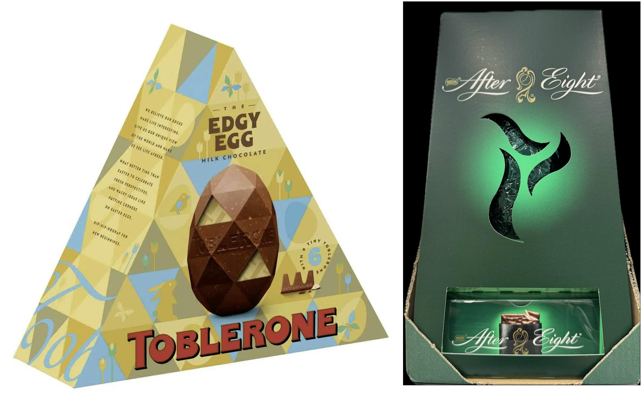
Another good technique for grabbing attention is novelty. The chocolate packaging in this category does feature some great examples of novel shapes and structures. For example, the use of pyramid shapes. Package designers rarely use pyramids in regular food packaging — probably at least partially for their suboptimal packing and storage — but they seem to have greater freedom with chocolate egg packaging, and pyramid shapes are used to great effect in several designs.
Also the use of windows. These can capture attention as we feel compelled to look through them. And they can further grab attention by showing the reflective coloured foil of the egg wrapping itself.
Designing great packaging is hard, and requires consideration of many different facets. At CloudArmy we combine an ability to measure the different facets of packaging with a theoretical understanding of the psychology of design, enabling us to interpret our research findings and provide actionable insights and recommendations.
By examining these chocolate egg packages we can see the potential for injecting creativity into pack designs but also the challenges in making them work. There are few other categories in which we see so many varied uses of color, shape, and generally creative design, making chocolate egg packaging the ultimate eye-candy!

