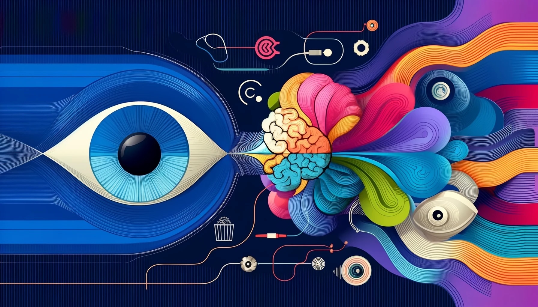
In my 25 years working in consumer neuroscience, studying what makes certain designs more engaging than others, one principle stands out above the rest: the power of simplicity. At CloudArmy, as we've analyzed countless commercial designs using methods like eye-tracking and timed response testing, we've consistently found that the most impactful visuals are those that are remarkably simple on the surface, yet still convey a wealth of information. This is the essence of what we call "Neuro Design."
So why does simplicity hold such sway over our brains? The answer lies in how our minds have evolved to process visual information. Our brains are pattern-seeking machines, constantly trying to impose order on the chaos of the world around us. The simpler a design is, the easier it is for us to comprehend its underlying structure and extract meaning from it.
The reason our brains are so drawn to simplicity lies in our evolutionary history. In the days of our early ancestors, finding enough food to survive was a constant challenge. Those who could conserve their energy had a better chance of living long enough to reproduce and pass on their genes. As a result, our brains evolved to operate in an 'energy save' mode whenever possible. This is particularly relevant when it comes to vision, as the process of seeing and interpreting visual information is actually incredibly energy-intensive. In fact, despite making up only about 2% of our body weight, our brains consume around 20% of our daily energy intake – and a significant portion of that energy goes towards visual processing. So, from an evolutionary standpoint, it makes sense that we would be drawn to visuals that are easy to comprehend – they allow us to conserve precious mental resources.
Think of it this way: every time we look at an image, our brains have to do a certain amount of work to decode what we're seeing. The more complex the image, the more energy this takes. And because our brains have evolved to be as energy-efficient as possible (a necessity in the days when our ancestors never knew where their next meal would come from), we're naturally drawn to visuals that we can understand quickly and easily.
But there's a crucial caveat here. A design that is simple in the sense of being minimal or bare-bones is not necessarily engaging. In fact, if an image is too basic, it can fail to hold our attention because there's not enough for our brains to latch onto. The key is to strike a balance – to create designs that are visually streamlined but also rich in information and meaning.
A great example of this principle in action is a well-designed infographic. By distilling complex data into clean, easy-to-grasp visual representations, an effective infographic can communicate its message far more efficiently than mere words or numbers ever could. Our brains love this because they can absorb the core insights almost instantly, without having to work hard to extract the relevant information.
The same idea applies to all sorts of other commercial designs as well. Examples of this include a product logo that uses simple, distinctive shapes and colors but also cleverly incorporates symbols related to the brand's values or personality; a website layout that features plenty of white space and a clear visual hierarchy, guiding the eye effortlessly to the most important content; or a print ad that tells a compelling story using just a single striking image and a concise, punchy headline.
In all of these cases, the designs feel effortless to take in, yet they also reward closer inspection with deeper layers of meaning. They're simple, but not simplistic. They give our pattern-loving brains just enough to chew on, without overwhelming them with extraneous detail or clutter.
Interestingly, this principle of "simplicity with depth" can be seen in many of the most iconic and enduring designs throughout history. The Nike swoosh, the Apple logo, the Coca-Cola script – all of these are incredibly basic shapes or letterforms at first glance. Yet each one is also imbued with a wealth of cultural associations and brand-specific meanings that have been built up over decades.
In a sense, these designs have become simple yet infinitely rich visual shorthands – tiny, efficient packages that instantly evoke a whole universe of ideas and emotions in our minds. From a Neuro Design perspective, that's exactly what the most effective visuals do. They waste no time in conveying their core message, but they also invite us to keep looking, to discover new layers of meaning and connection the longer we engage with them.
Of course, simplicity isn't the only factor that determines a design's effectiveness. Neuro Design also takes into account principles like visual saliency (using contrast and novelty to grab attention), first impressions (making sure a design conveys the right message in a split second), and emotional resonance (using shapes, symmetry, and other cues to forge a positive visceral connection).
But in my experience, simplicity is the foundation upon which all of these other elements depend. A design that is too busy or complicated will struggle to communicate anything at all, no matter how well it deploys other techniques.
That's why, at CloudArmy, we always start by looking at how a design can be simplified and streamlined, before we even consider other factors. By using eye-tracking and other tools, we can identify which elements of a design are truly essential for conveying the intended message and experience. Then we can start to optimize those core elements using additional Neuro Design principles to maximize their impact.
The end result is a visual that feels almost inevitable in its rightness - like it couldn't have been designed any other way. It's a difficult balance to strike, but when a design achieves that perfect harmony of simplicity and depth, the effect is magnetic. It draws the eye, calms the mind, and lodges itself in memory with an effortless, unshakable power.
So if there's one takeaway from the field of Neuro Design that I believe every visual creator should embrace, it's this: strive for simplicity, but not at the cost of depth. Look for ways to strip away unnecessary flourishes and distill your message down to its essence. But also think hard about how you can pack the most relevant information and meaning into whatever elements remain.
The sweet spot - that perfect balance of effortless comprehension and rich significance - is where the most powerful designs live. And with a combination of Neuro Design principles and rigorous testing, it's a destination that any brand or designer can reach. The result is the holy grail of visual communication: images that don't just grab attention, but leave a lasting impact as well.


